2019/12/26 - web
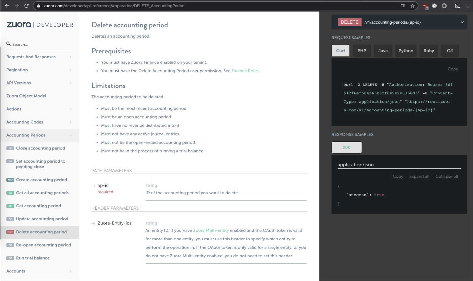
Documentation is an important part of advertising/learning how to use an API. Many of these documentation hubs have the same look and feel. Some of them were automatically extracted from code, where the instructions are needed and the code that responds to those instructions is written. It is nice having these two things, the code and the instructions, work side be side.
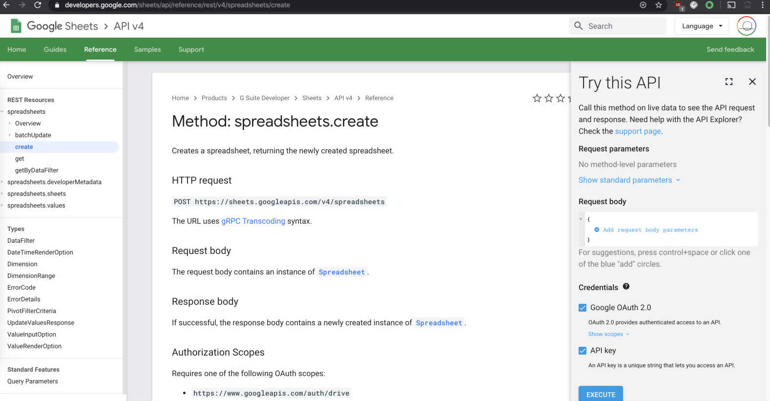
This Google Sheets documentation would be cool if it actually helped me understand what is going on. For example, instead of constructing your own query, they could give you all the variables and a sample sheet document to work with.
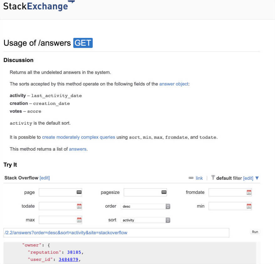
This Stack Exchange documentation has a nice little form at the bottom of each function to test it out. But these controls are just the default for the browser, no styling or nice highlighting what a field is entered correctly.
Stripe is probably the most complete, with the request and response samples set up on the side bars.
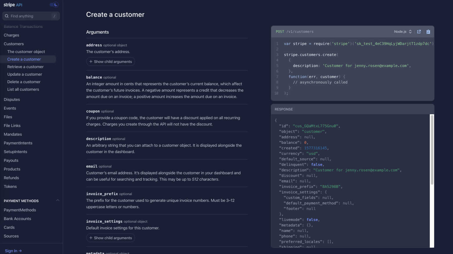
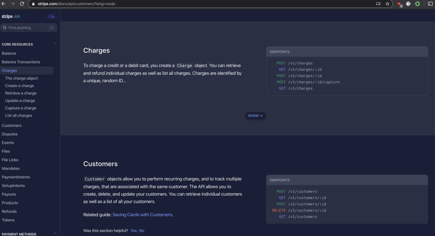
This is what I am aiming for with my next RPC documentation template. I want good solid examples, working content. I will update the controls to be more Material friendly.
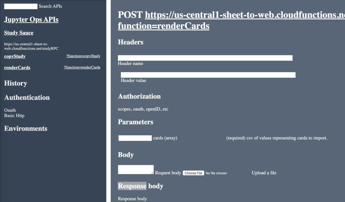
Menu from kyht, slide left/right versus fade it and slide from same side.
Material UI inputs in CSS only.